Introduction
To develop the skills and attributes required of an illustrator one usually specialises within a design or applied arts program. This course is not offered within such a context. The overview of the skills required of such a specialist and of the techniques available to them provided in this lecture is intended to give any person broadly involved with communication concept development an understanding of the range of approaches, specialisations and styles that may be applied in the field.
Also presented this week is a special case study of information graphics that arose from a variety of news media during the 14-day rescue following the Beaconsfield mine disaster. This study provides an opportunity to analyse information visualisation in the contemporary context of emerging and converging multi media. It is called "Anatomy of a rescue" and the commentary may be accessed from a link at the top of the right hand side column.
There are many hyperlinks provided wthin the body of this lecture to enable students to get a feel for the diverse array of fields and genres of illustration and information viualisation and the styles that are commonly associated with them.
What is illustration?
Definition: The act of clarifying or explaining. The state of being clarified or explained. Material used to clarify or explain. Visual matter used to clarify or decorate a text, in other words, to make it attractive.
(dictionary.com)
An illustration may describe or illuminate. As Michael Fleishman says, “It can make a stylistic or metaphorical point or describe an emotional sense or physical state” and thus can impact, intrigue or provoke. Like an effective news story most illustration is expected to: 1/ attract the attention of the reader/viewer; 2/ address the core questions of who, what, when, where and why for the viewer. (Fleishman 2004, 3)
Information Visualisation
To envision information…is to work at the intersection of image, word, number, art. The instruments are those of writing and typography, of managing large data sets and statistical analysis, of line and layout and colour. And the standards of quality are those derived from visual principles that tell us how to put the right mark in the right place.
(Tufte 1990, 9)
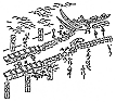
We are all familiar with the simplest ways to represent information in graphical form. The graphs and charts that we first experienced at primary school are examples of the translation of numerical data into visual format for ready assimilation, for visual comparison of data sets and, for the mapping of vectors and ratios. Other fairly common devices are timelines, schedules, scales, process flow charts, data flow diagrams, reference models, catalogues and maps of various kinds.
The art and the skill of effective information visualisation lies in the ability to translate from the abstract and/or complex to the visually meaningful and concise. International visual culture includes a long and fascinating graphical traditions in this regard.
Increasingly we turn to the power of the algorithm and computer processor to actualise visually meaningful translations of the immense amounts of information that our contemporary technological engagement yields.
Decision-making is a fundamental skill
The fundamental skill in regard to illustration and information visualisation is interpretation. This involves decision-making. The most important decisions are about:
- what is relevant and what is not in regard to:
- simplifying the information and/or message(s) and/or theme,
- highlighting the most salient, striking and important aspects of the communication;
- choosing the most appropriate format, style and technique with respect to:
- the context,
- the audience,
- the communication objective,
- the medium or media of communication;
- keeping a balance between the expressive qualities and techniques that lend impact, attractiveness and a sense of personal style to the work, and addressing the communication objectives.
The fundamental concerns in approaching an illustration are:
- concept,
- establishment of an appropriate point of view,
- composition,
- line,
- value,
- colour,
- pattern and texture,
- shape and form,
- repetition, rhythm and movement,
- harmony, balance and emphasis.
These considerations apply in relation to textual and typographic (textonic) elements as much as they do the pictorial (scriptonic) elements that may be incorporated into an illustration.
Medium-specific and context specific considerations
It is important when considering an illustration, and especially one that may have application across media types that there are technicalities and particularities to the media types that make it difficult to envisage one illustrational or technique style that will reproduce well across those media types.
For example, the technology for reproduction via printing process requires consideration about the number of colours that are to be printed. This is most often a budgetary constraint because most often, more colours of ink printed means more expense. This consideration is usually stated at the outset and will be a fundamental consideration in relation to style and technique. An illustration for a single colour publication will require strong and clear line work. Depending on the printing quality, the use of continuous tone may or may not be advisable. If it is not advisable then the only option for rendering light, shade and form may be to make use of hatching or stippling. An illustration specifically produced for this low-end form of reproduction is usually able to be reproduced in any other format, but may look out of place if used in a collection of illustrations using more sophisticated means of print reproduction, for example finer print resolution, continuous tone or more colours.
Generally speaking a full colour illustration produced for a print media is usually reproduced on a printing press using the four process colours: cyan, magenta, yellow and black. The colours in the illustration are separated into those ink colours and applied to the paper using a dot matrix which enables the eyes of the viewer to re-merge the colours into a semblance of the original. This process makes use of the subtractive colour model (see Lecture 7).
However, when illustrating for print there may be stylistic reasons for varying from these cost-driven imperative extremes. For example, a decision may be made to use using limited colour or duotone techniques for a specific communicative or thematic purpose.
Illustrations produced for other media have will have limitations and peculiarities specific to the medium. These may not translate well when applying graphics produced for one into another.
The colour model for digital, screen-based modes of reproduction is based on the RGB subtractive model (see Lecture 7). Illustrations for the web are generally optimised so as to consume as little bandwidth as possible. If jpeg format is used in the optimisation process, as would usually be the case with an illustration with photo-like continuous tonality and full colour, fine detail can be lost due to the artefacts induced by severe jpeg compression. An alternative to avoid this is to use gif or png format compression which tends to preserve finer detail. However, due to the nature of this type of compression colour range is sacrificed, particularly if the original illustration was not produced using a web-safe colour palette.
Illustrations and graphics for television need to avoid primary colours because they fluoresce and tend to bleed in a way that reduces clarity of detail. There are limitations imposed by the screen matrix of the television screen on how typography may be applied so as to remain optimally readable. There are also considerations regarding aspect ratio and these are compounded now with wide-screen options being available. What this means is that if the screen format is not considered salient details may be lost by being cropped out or the illustration as a whole may be distorted. With a television screen the viewing distance is quite different from the computer screen or a printed page and so there are different considerations regarding scale and detail.
Although the screens might appear similar on the face of it, the television screen and the computer monitor are imaged technically quite differently. Certainly, it should not be assumed that illustrations and graphics produced for the web will automatically be suited for television. Understanding the nature of these differences is of more significance now than ever before as there are more requirements to apply graphics and images from the web platform for use in interactive television.
Similarly, production of graphics for mobile and portable device applications demands a new highly condensed visual style and has its own technical peculiarities.
There are also different expectations from temporal and interactive media when compared to the static formats. Illustrations and graphics on television, video and movies may be expected to move or change over time. Perhaps if for no other reason than the historical precedents set by TV station and movie house promos, the viewer may have an expectation for spatial illusion and 3-D effects. Interactive media graphics are expected to invite the user to engage with them and then to respond to user input or action.
Increasingly with web and TV graphics and with mobile device interfaces there are opportunities to incorporate and implement information and data that is updated live and in real time. There are situations where input from the user results in processing and visual representation of both the process and the calculated result or the range of subsequent response options may be required. These considerations have more to do with the specialist field of information visualisation and will be discussed again later in this lecture.
One should be able to think of many other instances where socio-cultural, context-specific and technical, medium-specific considerations will influence the practical application of a visual solution to a communication challenge. For example, there may be the common factor of large-scale shared by advertising billboards (of the traditional poster type), digital billboards and the cinema screen. Can you list some common considerations for these applications? Can you list some context-specific considerations that may justify differences in conceptual approach with respect to each? Can you list some technical medium-specific considerations that may apply differently in each case?
For the reasons outlined above in situations where cross-media multi-purposing is envisaged it can be unrealistic to expect one illustrative solution to be applied over a range of delivery mediums. If such a requirement is known at the outset then the graphic or illustration should either be planned to comply with the requirements of the ‘coarsest’ reproduction medium or, different versions of the visual planned for each of the relevant media.
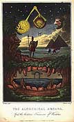
Contexts and genres for applied images
You will find as you peruse the links provided below there are no hard and fast rules about what style is suitable for a given communication context. In fact many a serious topic can be livened up by taking a less serious approach to the illustrations. However, this is where initial concept roughs and visuals become very important. Unless the commissioning art director or editor has been very specific and shown examples of what he or she expects, the style and thematic ‘tone’ or ‘voice’ portrayed by an illustration is something that may need to be negotiated. In the history of applied art there has been many an embarrassing moment when a finished artwork has been presented which has in no way met the expectation of the client. In such an instance there are inevitable repercussions regarding ego and reputation, not to mention payment! Usually such a predicament can be avoided through agreement on concept pre-visualisation and presentation of progressive drawings for evaluation and appraisal.
In the sample portfolios of illustrations included below you will probably notice that many of the illustrators have one or two styles that they specialise in. In some cases this style is the reason why they have been commissioned for certain jobs. An art director will have gone in search of a particular style to suit the communicative objective or his or her sense of who the audience is and what they will respond to. One of the artists, Christopher Short, shows how he often presents clients with an alternative finished illustration. This is fairly common practice. It enables the illustrator to stray from the brief and experiment a little whilst also addressing the brief to the letter. Sometimes a fortunate accident will occur that leads to a new conceptual or visual association or suggestion that ought to be considered.
Pigeon-holing illustrations into categories is a rubbery and inexact preoccupation as can be seen if one looks at the international illustration agency web site where images are arranged according to “Style Galleries” wherein it is difficult to find any overarching stylistic commonality: http://www.illustrationweb.com/
There are generally more recognised categories that group illustrations according to the purpose for which they are produced, for example “Advertising” or “Public Relations” or “Editorial”. In fact these three examples are arguably the most identifiable genres and these commercial fields possibly comprise the illustrator’s largest bank of customers. Advertising solves a given marketing problem by communicating what the client wants and needs the market to know (Fleishman 2004, 55). Public relations essentially perform a similar function but often under the guise of public information and targeted promotions. The editorial category is made up of newspapers, magazines and journals of all kinds. Each will have its “editorial tone” and “visual tenor” (Fleishman 2004, 56). Related but often considered a different market is the book publishing industry within which there are many sectors and among which possibly the biggest demand for illustration comes from the children’s literature sector.
Other clearly defined specialities include the technical illustrator and the medical illustrator. In each case the illustrator usually interprets a large amount of specialist data, eliminating unnecessary detail and finally drawing only the pertinent facts to tell the story. Technical and medical illustrations often allow people to “see” into the subject using cutaway techniques. Medical illustrations often explain the course of a disease or a treatment. For obvious reasons photographic realism is considered too graphic and illustration is most often the preferred way for medical professionals to communicate with the lay person. Similarly, technical illustrations explain a process or function.
As you peruse the following samples see if you can detect any characteristics that you would say are typical of a conceptual approach or whether there are indeed stylistic qualities more suited to a particular genre?
Selecting, mixing & matching techniques
There are some characteristic distinctions of style and quality (as in ‘effect’) that arise from the tools and techniques of drawing and illustrating. The traditional illustrational media fall into the following broad categories. The list is by no means exhaustive:
- Dry media (these are the ones most often associated with drawing). The effects of the media themselves are fundamentally conditioned by the type and texture of the paper or drawing surface.
- Graphite & pencils (variable hardness and thickness, ultimate control of line and tone)
- Charcoal (emphatic marks, smooth blending, paper-based texture or ‘tooth’, variable hardness and thickness)
- Conté (harder and less messy than charcoal)
- Pastel & chalk (soft & powdery, colour saturation, smooth blending and rubbing)
- Oil pastel (unique smeary blending, bold and brash, not good for detail or graduation compared to soft pastel or chalk)
- Crayon (unique semitransparent quality, good for ‘wax-repel’ in combination with wet media)
- Coloured pencil (huge range of colours and qualities with all the flexibility of graphite)
- Water soluble pencils (enable combination of dry and wet technique)
- Erasure (erasers are not just for fixing mistakes! Wide variety for tone removal and control and for detail work)
- Scratchboard (use of implements to remove a, usually black, coating from a board to reveal white line work with similar quality to etching or linocut)
- Wet media (more associated with painterly technique and not covered in this course). The qualities and styles achievable using wet media arise not only from the nature and consistency of the pigments themselves but also from the surface of the substrate (e.g. paper, board or canvass) and from the tools and techniques used to apply the pigments.
- Pigments
- o Water colour and wash (vibrant to subtle colour, transparency, unique blending qualities and tonal control)
- o Gouache (flat clean and bright colour, fine detail)
- o Acrylic (huge range of techniques and qualities)
- o Oil (huge range of techniques and qualities)
- o Tempura (similar to gouache, rich quality)
- o Impasto (textural techniques with thick paint and/or use of additives like plaster or PVC)
- o Inks and dyes (can be solid and permanent as in “Indian ink” which is specifically used for line work; or vivid, colourful and transparent)
- Tools and techniques
- o Brushes (used with all wet media and come in huge array of stiffnesses and softnesses, absorbencies, shapes, lengths, bristle types and materials of manufacture)
o Pens and nibs; felt and fibre-tipped pens and markers, (used with inks)
o Sponges, knives, spatulas and other applicators
o Airbrushes and spattering tools
o Stencilling and masking
- Mixed media (some commonly known examples)
- Pen with ink wash
- Paint with charcoal details
- Other traditional techniques
- Collage, montage and decoupage
- Cut paper or fabric
- Model-making
- Electronic and digital
- Photocopying
- Photomontage
- Computer-aided drawing (CAD) – technical
- Computer graphics, illustration and image-editing (2D)
- Computer generated (3D) modelling, animation and effects
- Tablet and stylus
- Interactive comics
- Augmented reality
- Virtual reality (Tilt Brush)
- Mixed reality
Many successful illustrations are the result of combining traditional and digital techniques. Increasingly software programs enable simulation of traditional techniques and provide unique effects not previously imagined.
The selection of the appropriate illustrative technique and style for a given communication is most often a matter of negotiation between the paying client, the creative director or team and the illustrational specialist. Only rarely will a commissioned illustrator be given carte blanche or unrestricted power to act at his or her own discretion.
An alternative approach to commissioning illustration is to select from a range of stock images of ready-made art, but of course, depending on the topic and the purpose, it is not always possible to find a pre-existing match.
Conclusion
The important thing to remember about all pictures is that even when they appear to represent with ‘scientific’ authority they are in fact interpretive and translative figures that express a particular understanding of information and relationships.
The reading for this week is a discussion of some of the diverse ways in which illustrations communicate understanding. In “Why illustrations aid understanding” David Kirsh proposes that effective visualisations rely on the logical method of universal generalisation to help viewers grasp general ideas.
Illustrations and visualisations are like individuals in a huge crowd of constantly changing faces that accompany us through all aspects of our daily lives. To stand out and to be recognised they must be, if not eccentric then at least, distinctive characters with familiar features.
References
Fleishman, M., 2004, Exploring Illustration: An In-Depth Guide to the Art and Techniques of Contemporary Illustration, Delmar Learning.
Tufte, E. R., 1990, Envisioning Information, Graphics Press.