Anatomy of a rescue: a case study of info-graphics
This case study reviews a selection of information graphics that were applied in various sectors of the media in their effort to provide the public with simplified information explaining the operation of the rescue mission at Beaconsfield Goldmine in Tasmania. This drama unfolded after a seismic event on Anzac Day 2006 triggered a collapse that left one miner dead and two trapped nearly a kilometre underground for 14 days.
Investor's view
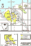
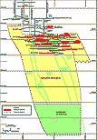
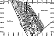
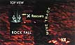
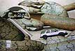
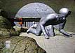
In the first slides (fig i–vi) there are examples of visual information provided by geological experts and so on in the context of providing information for the mine developers and for investors regarding the mine prospects. In the context of the company's web site these information graphics are supported by texts and photographic imagery such as fig vii.
 [i]
[i]
 [ii]
[ii]
 [iii]
[iii]
 [iv]
[iv]
 [v]
[v]
 [vi]
[vi]
 [vii]
[vii]
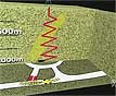
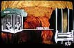
Situational overview
As news of the catastrophe broke one of the first tasks of the media artists was to convey for the lay-person a visual overview of the situation, including a conception of the scale of the underground operation.
 [viii]
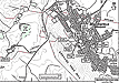
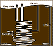
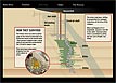
The image at fig viii is a simplified the view of the mine (possibly derived from fig v). An effective 2D line and tone graphic conveys the salient fact that the disaster site is very deep underground.
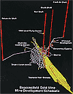
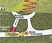
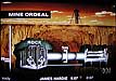
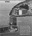
Another version with similar intention used a simple 3D primitive cube model with textures and graphics applied to the faces of the cube. More information is introduced about the layout of the rescue zone, including the site of the death of the third miner. The diagram on the base plane provides a clear map of the recovery and rescue sites. The image, presented during a TV news bulletin was animated so that it zoomed from a wider view horizontal to a closer vertical view. Even so, it could be argued that the information in the initial segment is less effectively conveyed than in the 2D graphic at fig viii and that the 3D cutaway technique employed here doesn't significantly aid a viewer’s understanding (figs ix, x).
 [ix]
[ix]
 [x]
[x]
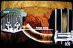
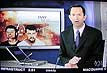
Supporting graphics
Figure xi is graphic supporting a TV news story. It serves to contextualise the otherwise standard audiovisual news presentation involving the news anchor and onsite presenters, interviews and live footage. Graphics for this purpose need to be bold and simple. They will often appear on a screen behind the presenter. If they occupy the whole view it is usually momentarily. Occasionally such images are used as a visual filler where there is no other visual to support an audio report.
 [xi]
[xi]
Interactive graphics
Figure xii is a still from an interactive graphic. As the user rolls over bullet points in the graphic textual explanations appear. Featured on The Age newspaper web site it is an adaptation of a graphic designed also for print.
 [xii]
[xii]
An emerging narrative
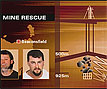
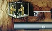
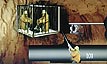
The missing men were confirmed alive and the media focused on the details of the rescue (figs xiii-xvi). Rescue plans emerged over days. The first task was to drill a pilot hole to the men to establish communication. Slow progress was made.
 [xiii]
 [xiv]
[xiv]
 [xv]
[xv]
 [xvi]
[xvi]
The television graphics evolved, keeping pace with the emerging narrative (figs xvii-ixx).
 [xvii]
 [xviii]
 [ixx]
[ixx]
Parallel documentation across the visual media
Compared to the TV graphics, the print and web graphics contain more detailed textual information yet they convey little more visual information (figs xx, xxi). They may be monotone as in these examples or colour as in figure xxii.
![]() [xx]
[xx]
 [xxi]
[xxi]
The TV graphics tend to be animated or to sequentially show more than one view. However they usually appear for no more than a second or two and so must quickly perform their function which is to support the audiovisual, providing spatial information that cannot be easily conveyed using live images or verbal descriptions.
In an unusual reversal of this trend, and what can be analysed as a profound demonstration of intertextuality, the late Richard Carlton, in his final on-location current affairs report for the Nine’s “60 Minutes” used a graphic from The Age newspaper to illustrate an assertion he was making. He held the paper in his hand and whilst the camera zoomed in on the graphic he used a pen to demonstrate his narrative in real-time.
 [xxii]
  [xxiii]
3-D modeled graphics
Channel Nine also featured a series of animated 3D modeled graphics of the scenario (figs xviv-xxvi).
 [xxiv]
 [xxv]
[xxv]
 [xxvi]
Interactive timeline
On the culmination of the rescue The Age published an interactive timeline as part of their online coverage (figs xxvii-xxvi).
 [xxvii]
 [xxviii]
 [ixxx]
 [xxx]
[xxx]  [xxxi]
 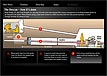 [xxxii]
Incorporated into this Flash-based info-graphic were diarised textual narratives and photo highlights, maps and information visualisations, plus audio and video grabs from radio and television media.
Conclusion
 [xxxiii]
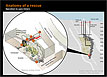
When compared to the other elements in the extensive and prolonged media coverage of this event, which involved an extreme level of competition especially amongst the major television news and current affairs personalities and their producers for the attention of viewers, the information graphics were delegated a low profile. By information graphics, I am referring here not so much to the illustrated headline banners that are often displayed on screens behind the television news presenters (as in fig xxxiii) but those visuals which bear the responsibility for distilling quite complex concepts and processes and conveying the salient details for the better understanding of a lay public. Despite their low profile these information visualisations perform an invaluable role.
It is rare for a media event to be as protracted in its resolution as the Beaconsfield disaster and rescue. The details concerning the rescue changed from day to day. In retrospectively studying the graphics used to explain the details of the rescue we may review the accuracy and truthfulness of the representations. How important was it to show where the tunnel was going to emerge? Was an accurate representation of the scale of the trapped men in relation to their cage important? There are obviously many variations of interpretation of this 'fact'! Was the difficulty of the drilling operation effectively portrayed? Were the complicating safety issues for all concerned conveyed?
In comparing the specialist geological, cadastral and commercial diagrams from the Beaconsfield Gold N.L. web site with the diagrams produced in the context of news for the general public we can see how important the specificity of context is in regard to the presentation of information.
One can also see from this study that there are situations that are indeed just too abstract or obscure or to complicated for other image channels such as photography and video to convey. This is where information visualisations come into their own.
The extended period of focus that this event provided has enabled greater opportunity than is usual for variations of concept, style and technique and for the different qualities of various graphic media modalities to be compared. We see traditional newspaper graphics and their hybridisation into hyperimage as some newspapers also apply the graphics with interactivity online. We can ask whether the requirement for multi-purpose graphics in this sense is influencing the conceptual approach, illustrative style and technique? We see single-image, sequential still-image narratives and, animated sequences in both 2-D and 3-D spatial formats. Is one format more effctive than another in this context? One may well ask whether the use of the semi-immersive, '3-D world', animated model, as in the samples from National Nine News, convey the essential information as effectively the more traditional style of diagram and schematic? Perhaps the 3-D animation provides a more experiential view that is quite different in intent and affect to those traditional communicative channels? If so, perhaps it should not be compared in this way because it serves an additional and quite separate purpose?
One thing one can say for sure: the info-graphic specialists associated with the country's newsrooms rarely have such an extended opportunity as this to review, reflect on and improve upon their efforts in relation to interpretation and depiction of a particular topic. How do you think they fared?
POSTSCRIPT:
In 2008 this case study was published in a journal as part of a larger paper, "Syncretism in narrativity, visuality and tactility: a case study of information visualization concerning a news media event". Refereed paper in Reconstruction Vol. 8, No. 3, 2008. Ganz, A. & Khatib, L. (eds) Special issue entitled Visualization and Narrative: