Introduction
In the prescribed text for this course Betty Edwards maintains that there are five components that make up the skill of drawing:
1/ The perception of edge (the ‘shared’ edges of contour drawing).
2/ The perception of spaces (in drawing called negative spaces).
3/ The perception of relationships (known as perspective and proportion).
4/ The perception of lights and shadows (often called ‘shading’).
5/ The perception of the whole (the gestalt, the ‘thingness’ of the thing).
(Edwards 2008, pp: xviii-xiv; p 96)
Author of a text on the art of illustration, Michael Fleishman, says that there are six “primary building blocks” in the illustration process:
composition and concept
line
value
colour
pattern and texture
shape and form
(Fleishman 2004, p28)
In the Week 3 lecture, we discussed composition as creating “an ordered relationship among the parts or elements of a work of art” (Edwards 2008, p275). Fleishman would likely concur with the emphasis placed in Lecture Week 3 on communication objectives for he writes:
…composition is putting the elements in the “right” place, arranging things in the “correct” order and establishing a “good” balance, but you must also discuss concept, content and message at the same time.
(ibid, p30)
In other words, ascertaining what may be “right”, “correct”, and “good” in relation to composition of ‘applied art’ is dependent on the context and the purpose of the illustration.
Likewise when we consider techniques for rendering light, shade, texture and colour in illustration and visualisation, the appropriate method to use will depend on the communication objective.
Typical considerations are:
- Whether to use colour or not? The answer to this question may be influenced by considerations such as:
- Budget (if the work is to be reproduced in print media, then full colour is more expensive to reproduce than single or two colours).
- Does the purpose require the simple description of concepts and/or relationships or does it call for emotive impact and appeal? If the former, then monochrome or limited use of colour may be appropriate. It may be that line-only drawing is required.
- Is mood and atmosphere important? If so then one may choose to heighten contrast and make use of strong shadows, or to soften and diffuse using a limited tonal range.
- Is the modeling of form required? If not then shapes may simply be drawn as outlines and, if colour is to be used then simply applied as ‘flat’ colour areas.
- Is texture and surface more or less relevant to the context? The answer to this question will impact on the decision as to which rendering technique to use.
The nuances of meaning of the word ‘render’ actually allude to these considerations: to submit or present; to give or make available; provide; to surrender or relinquish or yield; to express in another language or form, or to translate; to deliver or pronounce formally; to coat a subsurface with plaster or cement as in stucco over masonry.
In drawing and illustration, the term “render” usually refers to the technique used to finish off the representation. Decisions made by the artist about rendering influence how the image will be interpreted stylistically and communicatively; both as a representation and as a simulation. The approach to rendering may also influence how a drawing is constructed. For example one may decide to have edges defined by tone and not by line.
In computer graphics the term “render” means to convert an image from its digital file format into visual form, for example for screen display. In this sense there are also different kinds of rendering that yield different results for various purposes and effects.
In this lecture we consider some principles fundamentally involved in making the sorts of decisions outlined above.
To begin with we will explore tonal values according to the somewhat abstract concepts of a continuous gradient and steps of grayness which exist in-between pure white and pure black. We will then look at how chiaroscuro—the use of lighting and shade—is employed in drawing to differentiate shapes and to reveal form. We will see that tonality is not only integrally related to the definition of mass, volume and depth but also to the description of surfaces in drawing. In other words, tones may also be represented as textures. We will see that tonality is a relative quality but that it can readily be defined in terms of contrast and key.
Naturally, this whole discussion is grounded in observation of the energy form that we call light and the varying degrees of its absence that we call shade. We will also look at shadows and how they are cast, at some of the variable qualities of light and shade under differing conditions, and at the ways these may be represented.
Visual complexity is increased manyfold when colour is taken into account. Like tonality, colour can be organised into gradients and steps for analysis. A commonly used device for this is the colour wheel. In this lecture we will look at a basic colour wheel to show how colours can be arranged in terms of ‘colour temperature’ according to what are known as ‘warm’ and ‘cool’ colours and, at how this basic knowledge can enhance the portrayal of depth and the psychological impact of an artwork or design. We will see that colour may not only be understood in terms of hue and saturation but, like tonality, also in terms of contrast and key.
Scales of gray
In a typical black and white photographic print, for example one that might be the source for an image reproduced in a newspaper, the way the tones merge and blend into one another is referred to as continuous tone. We can make a scale of tones that smoothly transitions from the lightest tonal value (white) to the darkest tonal value (black) and this can be called a continuous tone gray scale.


If you use a pencil lead on its flat edge it is possible to smoothly shade up such a scale. However if one uses this technique to render a representation it not only takes a lot of time, it may end up lacking character, and may not adequately incorporate into the rendition of form the textures and patterns characteristic of the subject that drawing can so readily achieve. In most cases, if continuous tone, realistic representation is what is required, then a photograph can probably do a better job than a drawing.
Rendering tonal values
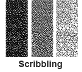
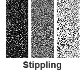
Rendering tonal values in drawing commonly involves one or more of the following techniques: hatching, scribbling (also known as scumbling), and stippling.
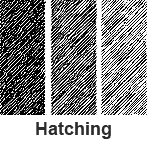
Hatching is where a pattern of parallel lines is used to create tonal value. The lines can be made thicker, drawn more closely together or indeed, both thicker and closer, to create a denser pattern and so a darker tone. Hatching can readily be achieved with any drawing implement.
Scribbling or scumbling is where a random, multi-directional pattern is used to create tonal value. This may include judicious use of smudging techniques (though purists like to keep their lines clean). For this reason it is perhaps more suitable for pencil, charcoal, pastels or crayons but it can be achieved quite successfully with a pen.
Stippling is made up of point marks or dots, usually in a random pattern. Density is built up by applying the dots more closely together. This technique is most readily achieved manually with a pen. An alternative is to use a stiff brush like a toothbrush loaded with ink. In this case the stippling is created by using a finger to cause the bristles to flick towards the paper. Masking of areas to stay clean of stipple may be required.
There are varieties of the above: For instance, in the case of hatching, there is:
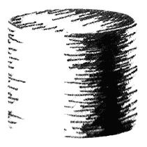
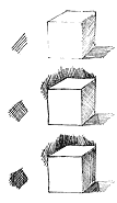
Cross hatching is where the layers hatching from different directions are employed to build up density of line or darker tonal value.
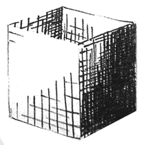 A simple example of cross hatching
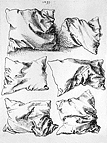
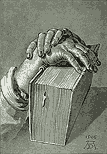
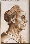
Contour hatching is where the hatching lines follow the form and help to describe the shape as well as the highlight and shadow.
 A simple example of contour hatching
Stippling enables one to achieve an effect close to continuous tone of a photo image. It can be very time-consuming to draw this way.
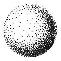 A simple example of stippling used to describe form
Tonal values differentiate shapes, reveal form, and describe texture (surface).
There are a number of advantages to using these techniques. Not only can tonal value of light as it falls across and reflects off surfaces and creates shadows be effectively represented by the density of the marks, but also volumetric form can be indicated by making use of line direction and, textures and patterns of surfaces may be incorporated into the rendering method. Varying the width and quality of strokes can introduce additional expressive qualities.
Often artists will make use of the surface texture of the paper itself when using these shading techniques. When drawing with pencil one can also be selective about which grade of hardness of lead one uses to control the tone and thickness of line. One can also use different edges of the lead to vary line and tonal quality. However, when using pen and ink the tonal value of each mark one makes remains constant.
Tonal values are relative and relational
One important aspect of working with tonality is to understand that our perception of tonal value is actually relative and relational. There is a famous illusory puzzle created by Edward H. Adelson that effectively demonstrates the extent to which this is so.
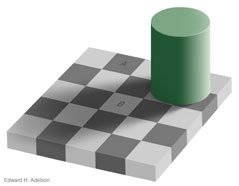
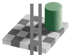
Source: http://web.mit.edu/persci/people/adelson/checkershadow_illusion.html
The principal of simultaneous contrast is what is demonstrated in this illusion. As we shall observe later, the simultaneous contrast effect works with colours that are opposites on the colour wheel as well as relatively situated monochromes as in this instance.


Source: http://web.mit.edu/persci/people/adelson/checkershadow_illusion.html
The central squares are in fact the same tone but when placed on a field of darker tonal value the central square appears to be of lighter tonal value, and when on a lighter field it appears darker.
Regardless of this foundational perceptual ambiguity, we have a number of terms that are commonly used and understood when talking about tonality. Some of them relate also to the way we describe apprehension of colour.
Common terms referring to tonal qualities
Contrast is the relative difference in tonal value between the highlights and shadows.
High contrast refers to the situation where there are predominantly either the lightest tones or the darkest tones with little of the middle tones (or mid-range) incorporated. This may also characterized as resulting from a ‘hard’, intense or brilliant lighting condition, with strong light from a predominant direction and little reflection to fill or soften the shadows. Extremely high contrast with only white or black areas is referred to as ‘posterisation’.
Low contrast refers to the situation where there is relatively little difference in tonal value between the lightest tone and the darkest tone. This may be characterized as resulting from a ‘soft’ or diffused lighting condition, where the light source is filtered and/or bounces around a lot in a space so that highlights may be relatively less intense and more light reaches to fill the shadow areas. Low contrast may also result from a situation where the angle of the predominant light source is the same as the viewing angle.
A broad tonal range is of medium contrast and exhibits a wide range of intermediary tonal values and may be used to show details throughout the range of both highlight tones and shadow tones.
Key is the dominant tonal value overall in a drawing. A predominantly light range of tonal values is called a high key. A predominantly dark tonal range is called a low key. If medium values predominate then obviously this is referred to as middle key, but as this is the usual it is less likely to be remarked on than the others. A high or a low key is usually employed for a specific effect or impact. For example a high key can be employed for an enhanced sense of subtlety or atmospheric illumination. A low key may be indicative of night-time, be employed to convey a morbid emotion, or to invoke mystery or heighten a sense of drama.
Lighting
Overall the patterns of light and shade are important compositional elements. They contribute to what Edwards calls the gestalt, or the representation of “the ‘thingness’ of the thing”. They also define the figure-ground relationship (refer Lecture Week 3) and help to provide the depth cues (refer Lecture Week 4) by which spatial depth may be interpreted.
Obviously if one is drawing from life one has some limited control over the lighting of a subject. Indeed to record the way light is naturally occurring in a situation may be one reason for initiating an artwork. However, in illustration and applied drawing and when drawing from the imagination one may decide what lighting condition to depict. Just as with the qualities of tonality already discussed, the light source and the way that shadows are depicted impact on the apprehension of the subject and meaning of the drawing. Shadows not only help to define shape and form they will also anchor an object to a ground and provide logical clues to the environment in which an object exists.
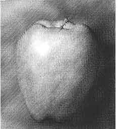
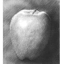
When planning an illustration it helps to consider how you are going to use light to enhance and support the objective of the communication. In the following example the addition of a light source coming from behind the apple in the right hand version provides a highlight that not only helps to define the form but also adds sparkle that lifts the apple from the page.
Shadows
The study of shadow formation and the technical means of calculating and projecting them in two dimensional representations is called sciagraphy. This field is often formally taught as an extension of studies in formal perspective. Indeed, to do the subject justice would require a devoted course of study. Fundamentally six factors influence the shape and appearance of shadows:
- location of the light source(s)
- geometry and orientation of the object(s) creating the shadow(s)
- the geometry, orientation and texture of the surface(s) where shadow is cast
- distance of the light source from the object casting the shadow
- apparent size, shape and quality of the light source
- differences in luminosity and colour between light source(s) creating shadow(s) and (if any) light source(s) illuminating the shadow area(s) e.g. incidental reflection.
Francis Ching says:
An understanding of linear perspective, and the perspective of shadows and reflections, is useful only if it goes beyond being an exercise in geometry. In order to reveal the depth of our vision, it must be integrated into a drawing composition along with the elements of line, shape, and tonal value.”
(Ching 1990 p 135)
Reflections and refractions, translucence and transparency
For the purpose of drawing and visualising, keen observation should yield satisfactory results. As scientist, Patrick Cavanagh says:
[T]ransgressions of standard physics — impossible shadows, colours, reflections or contours — often pass unnoticed by the viewer and do not interfere with the viewer's understanding of the scene. This is what makes them discoveries of neuroscience. Because we do not notice them, they reveal that our visual brain uses a simpler, reduced physics to understand the world. Artists use this alternative physics because these particular deviations from true physics do not matter to the viewer: the artist can take shortcuts, presenting cues more economically, and arranging surfaces and lights to suit the message of the piece rather than the requirements of the physical world.
(Cavanagh, 2005)
Also useful is to study examples of how artists have dealt with subject matter involving these problems.
Colour
Some colour basics
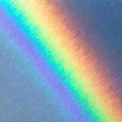
From high school physics most of us understand that white light, or sunlight, contains all colours. When we see a rainbow the refractive prismatic effect splits the light into the colours of the visible spectrum (electromagnetic radiation with wavelengths between about 380 and 700 nanometers).
There are two predominant models that are used for the reproduction of colour, the Additive Model and the Subtractive Model.
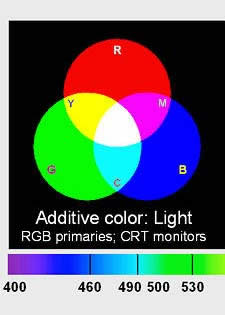
Additive Colour Model
This is used to model emitted, transmitted, or projected light from illuminated sources. Starting with three primary colours, red, green and blue, the mixture of all three of these colours of light makes white. The absence of any colour in this model is black. This is the model that is most likely to become familiar to you in digital multimedia studies because it is the model that computer monitors are based on. In that context it is commonly called the “RGB model”, a name that is given also to a common colour digital file ‘mode’ (as it is referred to in the image editing program Photoshop).
However, when one is referring to pigments as we are when drawing or printing onto paper, we make use of a complementary, or opposite, colour model:
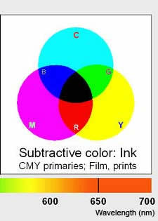
Subtractive Colour Model
This is used to describe how naturally occurring pigments and those that are applied to a substrate when drawing or painting absorb some wavelengths of light and reflect others. The colour that a pigment or an object appears to be is a result of all wavelengths of light being absorbed, or subtracted, except the those responsible for the apparent colour, which are reflected and so seen by the eye.
According to this colour model the three primary pigment colours are: yellow, red and blue. Theoretically from these three colours, all colours can be mixed. The absence of colour is white (or the colour of the unpigmented substrate e.g. your paper). When all colours are mixed together they, again in theory, will make black.
A variation of this colour model is one that is used for printing in full colour on a commercial printing press. Based on the properties of the inks themselves, the red is shifted to be a magenta, the blue shifted to be a cyan, and a black ink is added. This is the subtractive colour model known as the CMYK model—Cyan, Magenta, Yellow and Black (K).
For the remainder of this lecture references to colour will be to concerned with the subtractive colour palette as it relates to pigments, in particular to coloured pencils.
Colour wheels
Just to confuse the student of colour theory, there are variants of colour theories to describe, quantify and qualify colours even according to what we have established as the subtractive model. But then, this is what makes the field interesting. In actuality, all attempts to theorise and practically demonstrate the application of pure and universal colour theory fall short of their objective because of numerous factors including:
- the fundamentally subjective nature of colour perception,
- physiological factors that are experienced as perceptual uncertainties and aberrations, such as simultaneous contrast,
- ideological influences (that old ‘worldview’ thing again),
- the inconsistencies and incompatibilities inherent in the mineralogy and chemistry of pigment mixing,
- variations that occur when changing the colour intensity of pigments,
- variations that occur under different viewing conditions,
- when applying pigments as paint, there can be shifts in hue according to moisture content.
At best any colour wheel can only be an indication of a particular colour theory, and any colour theory will have its limitations.
The colour wheel most commonly used by artists organises colours according to the three primaries: yellow, red and blue; then mixes combinations of these to form what are known as the secondary colours: orange, green and purple; and then into tertiary colours: orange-yellow, yellow-green, blue-green, purple-blue, red-purple and red-orange—twelve colours in all. The theory is that all colours can be mixed from the three primaries. In practice this works only in the most rudimentary way and this is partly due to the actuality that we do not have pure enough pigments to start with.
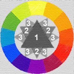 (1) Primaries; (2) Secondaries; (3) Tertiaries
The 12 colour wheel organises colours so that their complimentary or opposite colour sits opposite on the colour wheel. For example, the complimentary: of yellow is purple; of red is green; of blue is orange; and so on. Johannes Itten, a Swiss colour and art theorist who was teaching at the School of Applied Arts in Weimar, Germany is attributed with refining this version of the colour wheel and its associated theory.
As a result of experiments with light and prisms Issac Newton produced a very influential colour wheel in 1704. Because he was observing light, the proportions of particular colours on his hue circle relate to how we currently map colours against the electromagnetic spectrum. In this sense Newton’s work is more relevant to the additive model than the subtractive model of colours. One interesting aspect of his work was his own attempts, and subsequent attempts by others, to map his colours to the diatonic scale of musical notes. Newton was the first to join the two ends of the color spectrum together to show the natural progression of colours.
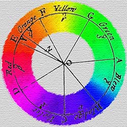 A representation of Newton's hue circle
This illustration of Newton's hue circle ignores the fact, which he calculated, that at the centre colours mix to white (as in today's additive colour model).
As part of his attempts to analyse colour phenomenologically - that is, as we experience it - in 1810 German poet and scholar, Johann Goethe proposed a colour wheel which he thought expressed the complimentary nature of colour and incorporated the magenta red that Isaac Newton had discovered.
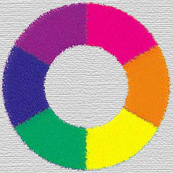 Goethe's colour wheel (rotated so 'plus' is at right)
Goethe's colour wheel was intended to categorise colours according to their psychological effect. He divided all the colors into two groups – the 'plus' side (from red through orange to yellow) and the 'minus' side (from green through violet to blue). He thought that colours of the plus side produce excitement and cheerfulness. Colours of the minus side are associated with weakness and unsettled feelings.
This is what we call the psychological effects of colour. These effects refer not only to how colours may affect people's moods but also to an apparent spatial depth. Because of the relativity of colour effects the following should not be taken as absolute rules:
| COOL |
ACHROMATIC |
WARM |
MARGINAL |
| Blue, turquoise, violet |
White, gray, black - may take on either a warm or a cool character with just a hint of color added |
Yellow, orange, red, brown |
Green, magenta |
| Relax |
A neutral gray may appear to take on the opposite hue to an adjacent colour and thus accentuate the characteristic of the adjacent colour |
Stimulate |
Affects will vary depending on the hue and which colours surround them - they will tend to the opposite |
| Recede or create spacious sensation |
Come forward or create close sensation |
If you want to know more information about history and theory relating to our understanding of colour refer to Bruce MacEvoy's extensive web resources listed in the links section of this lecture. MacEvoy is skeptical about the lack of scientific thought that has given rise to much so-called colour theory. He rightly points out the variables and inconsistencies that impact on making statements that may apply universally to the physiological and the psychological impact of colour. The interdependencies and relativities outlined at the beginning of this section so often interfere.
Common terms referring to colour qualities
Hue
This term is equivalent to the word ‘colour’ and the terms may be used interchangeably. However artists tend to use the word ‘hue’ to account for the subtleties of difference in colour. Hue is related to wavelength for spectral colors and is one of the distinct attributes of colour along with value and saturation.
Value
This term is equivalent to the words ‘brightness’ and ‘lightness’ and the terms may be used interchangeably.
When we referred to the gray-scale above, we talked in terms of tonal value. The relative lightness or brightness of a colour is referred to as its value. Thus ‘value’ is a term equivalent to ‘brightness’ and is another of the three fundamental attributes of colour.
The image below is the same as that used above to illustrate the 12 colour wheel. In converting the image to grayscale mode in Photoshop all hue has been removed and so what we see is the tonal value of each colour.
In the natural world, things are not so straight-forward as clicking a button to remove all colour. When drawing in monochrome (with a pencil or a pen) interpreting the value of a colour and translating it to an equivalent grey or hatched tonal value is a fundamental skill. Francis Ching lists some of the considerations we encounter in perceiving value:
- Some hues reflect more light than others, which is why we perceive them as being lighter or paler than others.
- Shades of the same hue vary in tonal value. For example, sky blue and indigo blue are the same hue, but the former is inherently lighter in value than the latter.
- The way light illuminates a colour and makes it visible affects its apparent value. A highlight on a coloured surface will appear much lighter than the same hue seen in shade or within a shadow.
- Surrounding hues or values alter our perception of a colour or hue.
(Ching 1998 p 41)
Saturation
Saturation is a term referring to the purity of colour or, more technically, chroma. One can think of saturation also as the intensity or the vividness of a hue. Another way of describing saturation is according to its inverse: the more a colour is diluted with white (either by watering down an ink, by adding white to paint, or by more sparse degree of hatching when drawing, or indeed by causing more reflectance by increasing the relative intensity of a light source) the less colour saturation will be apparent. In other words, saturation is related to how much white content is in the stimulus.
These three attributes: hue (colour), value (brightness, lightness), and saturation (intensity, vividness) are not only used to qualitatively describe colours in the artistic context, they also form the basis of systems that quantitatively measure colours as they exist in real contexts and as colours are applied in systems of reproduction and representation.
Shades and tints
These are relative terms usually used to describe value in relation to an established colour reference. Shades refer to values lower than the reference and tints to values higher.
Complementary colours
Complementary colours are those that exist opposite each other on a colour wheel. In painting theory (subtractive model), the result of mixing equal quantities of complimentary colour pigments is black (using the adaptive model and mixing light the result is white).
Referring to Goethe’s 6-colour wheel (above) there is a unity inherent when we observe the complementary colours in that any colour has as its complement the result of mixing the other two primary colors.
Simultaneous contrast of colours
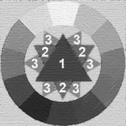
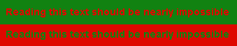
Areas of complimentary hue of equivalent value and saturation will exhibit a physiologically experienced phenomenon known as simultaneous contrast.

In its most basic form this is a kind of optical ‘vibration’ caused by the tendency for us to perceive that colours to shift their hues into the direction of the complementary colour. Some people experience nausea as a result of it. Conventional wisdom has it that one should avoid simultaneous contrast in a composition, but there are situations where it has been used effectively for impact. Certainly, if one needs text to be comfortably readable one should avoid the use of complimentary colours.
There are variants of this phenomenon.
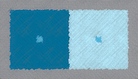
The image above shows that the same colours (as here in the centred swatches) seen against different coloured backgrounds may appear different. This is due to a phenomenon related to simultaneous contrast known as ‘hue induction’.
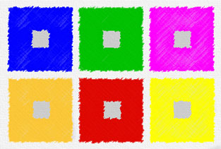
In the image below the gray swatches are all of the same neutral gray tone yet the hue that each appears is influenced by the surrounding colour.
Cultural influences
Attitudes and emotional responses to colour are particularly susceptible to cultural influences; to worldview. The following table gives a very precusory overview of some of this variety.
Culture |
Red |
Blue |
Green |
Yellow |
White |
USA , Europe |
Danger |
Manliness, sweet, calm, Authority |
Safety, safe, sour |
Caution, Cowardice |
Purity |
France |
Nobility |
Freedom, Peace |
Criminality |
preliminary |
Neutrality |
Egypt , Arab Nations |
Death |
Virtue, Faith, Truth |
Fertility, Strength |
Happiness, Welfare or Wealth |
Joy |
India |
Life, Creativity |
|
Welfare or Wealth, Fertility |
Success |
Death, Purity |
Japan |
Anger, Danger |
Shame, Despicableness |
Future, Youth, Energy |
Grace, Dignity, Nobility, childish, joyful |
Death |
China |
Happiness, Joy, Festivity |
Sky, Clouds |
Ming dynasty, royal, Honor |
Birth, Wealth, Strength or Power |
|
Source: various
Finding one’s own colour sense
Given the instability of affects and effects inherent in colour vision and apprehension the most practical advice that can be offered is for a student to experiment and find their own sense and language of colour. This can only be achieved through experimental practice. Through trying things out and critically analysing the results in the context of specific communication objectives one can build visual aptitude and skill.
The week 11 tutorial is deidicated to exercises using coloured pencil techniques including making a colour wheel by layering only the three primary colours. Feel free to jump ahead to experiment with colour if you wish.
References
Cavanagh, P., (2005) "The artist as neuroscientist” in Nature 434, 301-307.
Ching, Francis D. K., (1990) Drawing - a creative process, John Wiley & Sons, Inc
Edwards, B., (1999) The New Drawing on the Right Hand Side of the Brain, Tarcher-Putnam
Fleishman, M., (2004) Exploring Illustration, Thomson, Delmar Learning
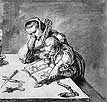
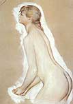
 [fig xv]: Redon
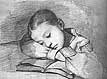
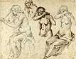
 [fig xvi]: Matisse
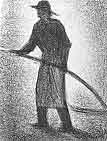
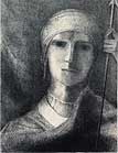
 [fig xvii]: van Gogh